From disjointed design to poor audience targeting, there are lots of potential reasons your landing pages aren’t converting like they could. Here are some of the top landing page mistakes marketers make and what to do about them.
If you find yourself asking, “Why is my landing page not converting?” you’re not alone.
When the reason can be anything from complicated copy to technical issues, it’s not easy to pinpoint why your landing page performance might be lacking.
So sit back, relax, and check out eight common reasons your landing pages aren’t converting — plus how to fix them.
Why your landing pages aren’t converting (+ solutions)
Truthfully, there are a thousand nitty-gritty reasons your landing page might not be performing the way you want. Here are some of the most common:
- Your audience targeting is off
- Your landing page doesn’t match your ad
- The CTA is unclear
- Your page loads too slowly
- It’s not mobile friendly
- The page is too wordy
- There are too many distractions
- People don’t trust your page
1. Your audience targeting is off
First and foremost, if your landing page isn’t targeting the right audience, you’re not going to see the conversion rate you want to see.
This can happen due to a mismatch in demographics or you may simply be using the wrong marketing channel.
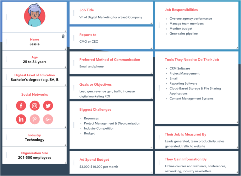
Solution: Dig into customer data and flesh out your buyer personas. Pertinent information might include a person’s age, job title, location, goals, and their biggest challenges.
Understanding your target audience at this level will help you tailor landing page content and design to their specific needs, preferences, and language.
When you gather all the relevant info, you’ll be able to create an ideal customer template like this:

Buyer persona example. (Image: HawkSEM)
2. Your landing page doesn’t match your ad
This one may seem simple, but it’s a big one. If your landing page design, tone, or language doesn’t match the ad a user clicked on, it can be confusing.
Best-case scenario, they’ll click around a little bit and try to find what they’re looking for — worst-case? They bounce.
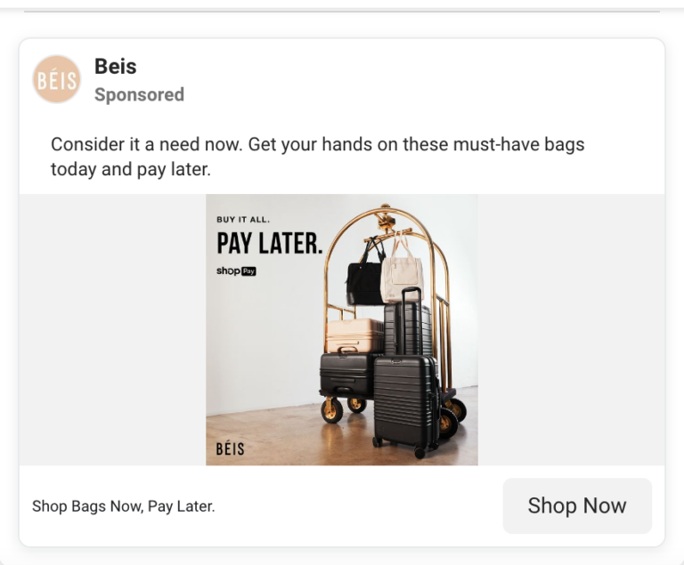
Solution: Familiarity is your friend. Keep your design, imagery, and call-to-action consistent from your PPC ad all the way through to your landing page.
For example, this ad’s CTA is “shop bags now, pay later”:

(Image: Beis Meta Ad screenshot)
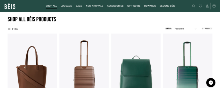
And it leads to a landing page that has consistent headline, fonts, and imagery:

(Image: Beis landing page screenshot)
3. The CTA is unclear
The purpose of advertising is to get your audience to perform a specific action. Therefore, you want to make sure it’s clear what action you want them to take – and that they know what they’re getting into.
For example, if your “Buy Now” CTA takes the user to a lead generation form, they’re not very likely to stick around on your page.
Simple CTAs like “Learn More” or “Submit” can work wonderfully, but strategically crafting creative ones can further encourage the reader to click.
Solution: Your CTA should be clear, concise, and specific. Here are some best practices:
- Design Use contrasting colors to make your CTA button stand out.
- One offer per landing page Multiple CTAs on one page can be confusing, and make it less likely the reader will click at all.
- Get specific about benefits If you want readers to watch your webinar, for example, instead of “Watch Now” try something like “Access the Latest Marketing Insights.”
- Make it personal: After analyzing and comparing over 330,000 CTA’s over a 6 month period, HubSpot found that personalized CTAs perform over 200% better than basic CTAs.
4. Your page loads too slowly
Ready for a wild stat? According to Portent Analytics, an ecommerce site that loads within one second has a conversion rate 2.5x higher than a site that loads in 5 seconds.
If a user decides to click, you have a 2-3 second window in which to keep them on your page. A super-fast page load speed does wonders for both search engine rankings and user experience.
Solution: Optimize your page load speed. You can do this by reducing unnecessary code, compressing images, and using a reliable hosting service.
Google even offers a PageSpeed Insights tool to help identify areas of improvement.
5. It’s not mobile-friendly
Unbounce’s latest benchmark report shows some interesting insights into desktop vs. mobile conversions.
One analyst at Marketing Charts notes that conversions on desktop are a bit higher at 12.1%, while mobile conversions account for 11.2% – but mobile visits take the cake at nearly 83%.
This shows that while customers may not be converting as much on phones or tablets, they’re definitely clicking around your site.
Poor navigation and user experience are turn-offs for users, and ensuring your landing pages are optimized for mobile can help improve SEO as well as conversions.
Solution: Optimize your page for mobile by ensuring fast load times, easy-to-tap buttons, and responsive web design.
6. The page is too wordy
No matter the purpose of your landing page, being too verbose or jargon-y can cause folks to bail.
Oftentimes when it comes to selling a product or service, less is more. Keep your content concise, easy to read, and focused on why users should convert.
Solution: Keep it simple! Your landing page copy should be benefits-focused, and persuade users to complete the CTA. Additionally, the more scannable your page is, the better.
Here are some quick tips to try:
- Informative headers (and subheaders)
- Jumplinks
- Bulleted lists
- Shorter sentences
Further reading: How to Create Landing Pages That Convert
7. There are too many distractions
Like being too wordy, having too many distracting elements on your landing page leads to overwhelm and decision paralysis for users.
When your page has too many external links, pop-ups, or lots of animations, you may be offering website visitors too much choice. The more choices there are, the longer it takes to decide.
Solution: Simplify landing page elements. The best landing pages are usually the ones that are as straightforward as possible.
And keep in mind that any links other than your call-to-action give users a reason to leave your page before you want them to.
Use bold headlines, plenty of white space, and crystal-clear fonts to make the experience as smooth as possible.
Here’s an example of a solid landing page I arrived on after clicking on an Instagram ad:

(Image: Brooks landing page screenshot)
The ad is for a specific running shoe, and the landing page takes you straight to the product.
It’s easy to read, has great use of white space, and offers more information about the shoe’s quality, features, and highlights customer reviews.
Sweet, simple, and effective.
8. People don’t trust your page
It’s no secret that people are most likely to take recommendations from someone they trust. The same principle applies to digital marketing.
After all, users aren’t likely to visit your site at all let alone fill out a form or make a purchase if they’ve never heard of you before. So, how do you fix it?
Solution: Leverage social proof. Including trust indicators on your page such as client testimonials, star ratings, and reviews can get more eyes on your business in no time.
In fact, HubSpot reports that for half of all consumers, the next step after reading a positive review is to visit the company’s website. That’s one step closer to making a purchase or getting them on your email list.
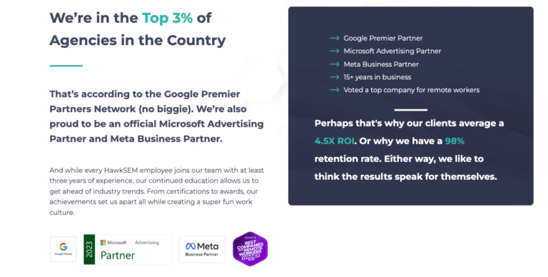
For example, featuring certifications or other honors prominently on a page is a good way to catch the reader’s attention and get them to stick around:

Trust indicator example. (Image: HawkSEM)
9 ways to determine what’s working on your landing pages and what’s not
The trick here is to simply collect and analyze data. Here are a few tried-and-true methods to consider:
1. Set clear goals & KPIs
Make sure your primary conversion goal is clear (e.g. form submissions, email sign-ups, purchases, etc.).
2. Use heatmaps
Heatmaps are an awesome tool that shows you where users are clicking, which areas they interact with most, and how far they scroll on your page.
For example, if web page visitors aren’t scrolling down or interacting with the most important elements on your page, it may indicate you need to switch up the layout or design. Or, if they’re clicking on non-clickable elements, that could indicate confusion.
3. Conduct A/B testing
This involves running two versions of a landing page with different elements to see which performs better.
Common testing elements can be just about anything from copywriting and design to testing, countdowns, limited-time offers, or creating a sense of urgency.
4. Analyze bounce rate
Bounce rate reflects the percentage of landing page visitors who leave your page without taking any action.
A high bounce rate can indicate:
- Your content is irrelevant to the target audience
- Content is misleading
- Confusing or poor design and user experience
- Your value proposition is unclear
Keep in mind that a high bounce rate on its own isn’t necessarily bad. We recommend measuring this alongside other metrics such as time on page, session recordings, and of course, conversion rate.
5. Monitor time on page
Time on page shows how long people stay on your landing page. If folks leave your page quickly, you may have issues with content, page complexity, or load time.
6. Check form abandonment
This metric monitors when users start filling out a form but don’t complete it.
Try simplifying your forms by reducing the number of fields, using multi-step forms, or adding an autofill functionality.
7. Analyze session recordings
Session recording tools capture a video of actual user interactions on your site. This is extremely useful for identifying specific points of friction.
Analyze how users interact with the page. Are they confused or maybe hesitating? Perhaps they’re encountering technical issues? Use these insights to make improvements.
8. Check traffic source & user behavior
Monitoring user behavior and traffic sources shows you where your users are coming from (e.g. social media, search engines, email campaigns, paid ads, etc.).
When you have that information, you can determine if there’s a mismatch between the landing page content and the traffic source.
For instance, if your Instagram ad shows a specific travel bag and the landing page takes you to a blog rather than the product description, users are more likely to bounce.
9. Visualize your funnel
A key piece of landing page optimization is understanding the customer journey. Analyzing your funnel helps you visualize how potential customers move through your conversion process and helps identify the drop-off points.
What’s a good landing page conversion rate?
Keep in mind that a “good” conversion rate is relative. It depends on your industry, the traffic source, what you’re offering, and who your audience is. Think of these benchmarks and averages as a useful starting point.
If your landing page is converting between 2% and 5%, you’re performing about average. Hubspot reports that the average conversion rate for landing pages across all industries is about 5.89%.
Generally speaking, 10% is the benchmark for what’s considered a “good” conversion rate. High-converting landing pages may even see as much as 15% to 25%.
Conversion rate isn’t the end-all-be-all, but it’s a vital metric to track. After all, a good one means you have a solid list of potential customers.
Further reading: Conversion Rate Explained: What’s a Good One? (+ How to Improve It)
The takeaway
A good landing page has consistent copy and design, is informative yet concise, and helps build trust with your audience.
That’s not an easy task to accomplish. However, by monitoring landing page performance, testing, and optimizing as needed, you’re sure to see your conversion rate go from drab to fab.
And if you need a hand? HawkSEM can help you pinpoint areas for improvement and take your marketing campaigns to the next level.