High-converting landing pages focus on elements like clear headers, a consistent call-to-action, and a strong value proposition. From effective design elements to optimization tips, here’s what you need to know to create successful landing pages.
When it comes to paid search, the ad itself is only part of the equation. Once you get that coveted click, there’s more work to be done.
That’s where your landing page comes in.
Landing pages can make or break your campaigns. The best landing pages can address customer pain points, build trust, and offer impressive conversion rates.
Not-so-effective ones, on the other hand, garner little more than a high bounce rate and wasted marketing spend on clicks that don’t convert.
In this guide, we’re giving you everything you need to know about landing pages and how to create ones that get results.
How to create high-converting landing pages
You won’t know exactly what works best for your landing pages until you test them. However, a few key elements can help ensure your landing pages are as targeted and effective as possible.
Whether you’re using a landing page builder like Unbounce, partnering with an agency, or starting from scratch, start with these best practices:
- Start with an eye-catching hero image
- Write a compelling headline
- Craft concise supporting copy
- Add a lead form
- Create one strong call to action
1. Start with an eye-catching hero image
The hero image is the main image at the top of your landing page above the fold, or the area that can be seen without scrolling.
Some companies will use this area to showcase their product, while others will use graphics or illustrations that represent their brand.
Here are some things to keep in mind when creating your hero image:
- Keep it simple to avoid making the page feel cluttered and creating an overwhelming user experience.
- Use high-quality images or graphics. If you don’t have someone on your team to handle design, consider outsourcing the work.
- Choose images and fonts that complement the design of the page and align with your branding.
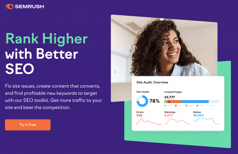
Semrush’s hero image for this SEO landing page incorporates both a high-quality image and a graphic that highlights the information you can get from the tool.
It’s simple and clear while using the company’s branding.
2. Write a compelling headline
Your headline is one of the most important elements on the page. It’s the first thing that a visitor will read, so it will play a major role in whether or not they read the rest of the page.
The headline should highlight the benefits of your offer and tell the user exactly what they will get when they hand over their information. Often, it will be followed by a subheadline that provides additional context.
Here’s a great example from Netflix:
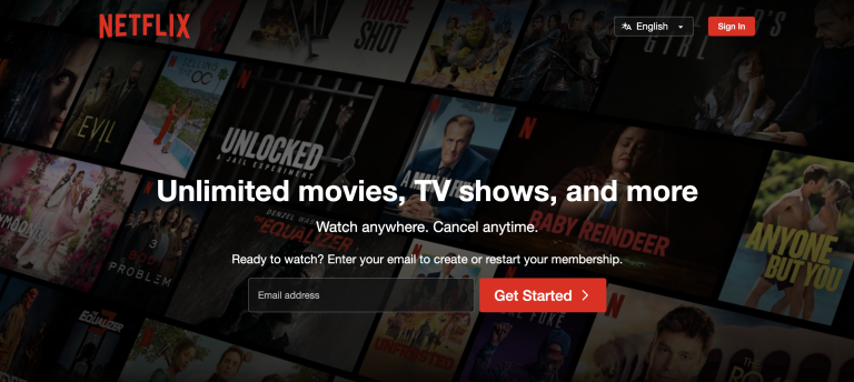
The copywriting tells you exactly what the streaming service is and the benefits it provides. It’s simple and to the point but effective.
3. Craft concise supporting copy
Sometimes, the heading and subheading are enough to convince the user to take the desired action. However, you can use supporting copy to provide additional context and value propositions that encourage the user to take action.
If you decide to use supporting copy, you need to make it clear and concise. Use bullet points to highlight the important details, and make any statements you want to stand out bold so that people scanning the web page will get the point.
“Writing high-converting landing page copy is a science and an art. The single most important thing? Clarity,” says James Wilkinson, CEO and co-founder of Balance One Supplements.
“Your landing page needs to immediately communicate who you are, what you offer, and why this offer matters to the user who just clicked on the link. If you confuse the visitor, you’ve lost that conversion.”
The Balance One marketing team recently created a landing page for their sleep-support supplement.
Wilkinson shares that while the initial version was well-written, it used a lot of industry jargon, and there was no clear call to action.
Through A/B testing, they found that the average conversion rate jumped from 2% to 8% when they used a landing page version with more concise copy, a benefit-focused headline, and a big “Buy Now” button. It’s the power of clarity in action.
Pro tip: Adding the element of social proof in the form of trust signals like client testimonials, metrics, or stats about your product’s success can help drive the point home.
4. Add a lead form
If you’re using a landing page for lead generation, you need to include a lead form where users can enter their information.
These forms usually use CRM integrations and automation to funnel leads into an existing workflow that can nurture them down the funnel in real time.
But, while you can ask for whatever information you want, it’s best to only ask for the information you absolutely need. The more contact form fields you have, the longer the form takes to fill and the less likely visitors are to fill it out.
The form fields you use will depend on what you’re offering and what information you need from your leads.
But in many cases, simply asking for an email address is enough (or a first name and an email address) to get the info you need while offering a user-friendly experience.
5. Create one strong call to action
Since the goal of your landing page is to get the user to take a single action, you should have just one call-to-action button.
If it’s a lead generation landing page, the CTA button will come at the end of the form. Once the user fills out the form, they’ll click the button to submit it. The CTA copy should tell the user what will happen after they click on the button.
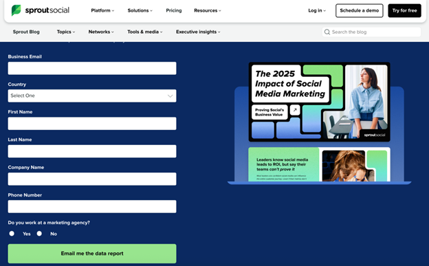
Here’s a great example from Sprout Social. Once the user fills out the form, they click the green button to download the report. The clear CTA (“Email me the data report”) is concise and eye-catching.
(Image: Sprout Social screenshot)
If it’s a click-through landing page, the call-to-action will be a button that takes the user to the final step, whether that’s to make a purchase, schedule a consultation, or start a free trial.
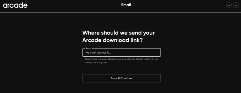
Here’s an example of a click-through landing page from Arcade. The CTA — “Try Arcade Free” — is simple and clear.

After you click on the CTA button, it takes you to the next step where you enter your contact information to start the free trial.
How to design a successful landing page
When designing your landing pages, experience tells us that the most important word to keep in mind is “minimalism.” That’s because, more than anything, you want your page to have a clean layout and be free from distractions.
Anything that could divert the visitor’s eye from your CTA will only do your page a disservice.
“One of the biggest mistakes people make with landing page design is cluttering the page with too much information or unnecessary design elements,” says Jenna Adams, CEO and founder of Avenue Perth.
“A cluttered layout can overwhelm visitors and distract them from the primary message and call-to-action. Keep your landing page clean and focused, with a clear hierarchy of information and minimal distractions.”
Because people are often pressed for time, you don’t want the viewer to have to do a ton of scrolling to complete the desired action. Along with a clean design, it’s wise to keep things short and to the point.
One easy way to stick to a less-is-more aesthetic is by excluding elements that appear on your regular site pages. Think: your header navigation or subscriber box for your newsletter.
These are great to have on your regular pages, but they can potentially make your landing pages cluttered, depending on what other elements are in play.
Instead, you could simply hyperlink your logo to your homepage, where visitors can find these page elements if needed.
Each design element should serve to tastefully draw the reader’s eye to your CTA. This includes things like whitespace and thoughtful imagery, such as stock photos, color blocks, or informative charts.
(Whitespace doesn’t necessarily mean “white” in color — just free from text, images, or graphics.)
Common landing page mistakes to avoid
There’s almost always room for improvement when it comes to your landing pages. However, we’ve seen companies repeatedly make a few common landing page mistakes.
These include things like:
- Neglecting to test your forms
- Too many design elements on one page
- Boring, generic CTAs
- Clunky, jargon-filled copy
- Distracting animations or pop-ups
- Slow page speed
Perhaps one of the biggest mistakes we see with landing page design is a lack of mobile responsiveness.
Given that more than half of organic search visits come from mobile devices, you need to design landing pages that can be easily navigated from smaller device screens.
“A pivotal element when designing landing pages is prioritizing usability and visual hierarchy to guide the user effortlessly towards the CTA,” says Brian Kratt, head of design at Plumb Development.
“One glaring mistake I’ve observed is the lack of emphasis on mobile responsiveness, which can alienate a significant portion of the audience.”
By focusing on a mobile-first design approach for a specific project, Kratt and his team ensured that key elements like CTAs were prominently displayed and easy to interact with on smaller screens, resulting in a 30% increase in conversions from mobile users.
The good news? Once you know to look for these issues, any that you come across can usually be addressed and fixed quickly.
How to optimize a landing page for conversions
Driving conversions is the goal of most landing pages. Because of this, any optimization tweaks or tests conducted should aim to increase those conversions.
For starters, spend time brainstorming a handful of attention-grabbing headlines that you can then test to see how your audience responds.
From there, make sure your copy highlights the value you can provide your visitor or what problem your product or service can solve, using proof points such as client testimonials or badges if you have them.
These elements are often more effective than when a company simply brags about its greatness.
Basically, optimized landing pages focus on what value your company can bring to the visitor, not on your company itself.
Other conversion rate optimization (CRO) strategies for great landing pages include:
- An easy-to-complete form
- Proof points that illustrate your credibility
- A special offer of some sort
- A mobile-friendly experience
- Social share buttons
- A plan for consistent element testing and analysis
Heatmapping
Heatmapping tells you a lot about how your audience interacts with your landing page. This tool shows things like scrolling behavior, where on the page people gravitate to most, and how activity might vary on different devices.
Heatmaps give you insightful data that you can use to improve your landing pages for conversions.
For example, if you find that users are spending the most time on a certain area of the page, you might put the CTA button there.
“A key to landing page optimization is using a data-driven approach,” says Robert P. Dickey, President and CEO at AQ Marketing. “Utilizing heat mapping to track user interactions can significantly inform design adjustments.”
Dickey describes one project where his team used heatmap data to determine they needed to move the CTA button. They moved it above the fold and increased conversions by 25%.
A/B testing
A/B testing is another way to get data that can help you optimize your landing pages for conversions. With A/B testing, you can test different elements of your page, one at a time, to find the variants that work best.
For example, you might test two different CTA buttons to see which one gets the most clicks. The key to A/B testing is to only test one variant at a time while keeping the rest of the page exactly the same.
This is the only way to determine if the variant you’re testing is the element impacting conversions.
“Never settle on your first version of your landing page,” says Colt Agar, organic marketing lead at Red Stag Fulfillment.
“Instead, test as many elements as possible to identify which key features resonate the most with your audience and drive the most sales.”
He adds that headlines, photos, color schemes, and calls-to-action are all fluid for the first few weeks or months of launching your landing page.
Iteration will help you strengthen your conversion strategy, so be open to trying different combinations of ideas until you find one that works best.
Further reading: What is Google Ads Landing Page Experience? How to Improve It
Effective landing page examples
Just like there’s no single path to increase landing page conversions, there’s no one right way to design your landing page.
With that in mind, here are a few landing pages for brands we’ve worked with that not only ended up paying for themselves, but that resulted in more time on site, increasing conversions, a reduced bounce rate, and more.
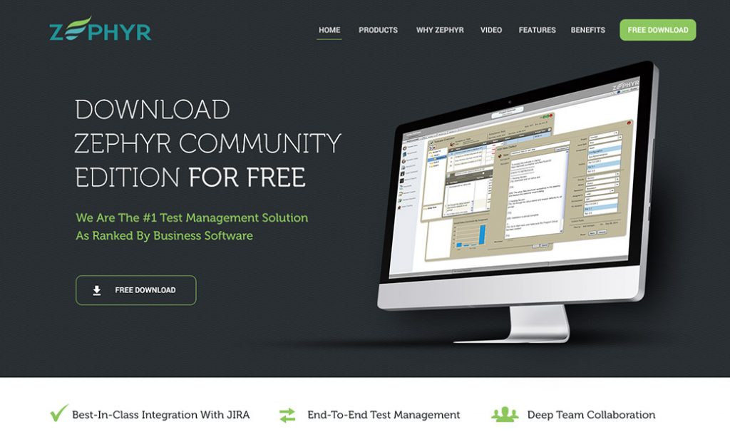
What makes it successful: This landing page for test management software company Zephyr gets down to business. The offer is clear, the design is minimal, and the claims are backed up by impressive proof points.
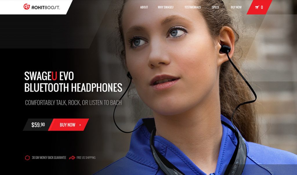
What makes it successful: This landing page for Bluetooth headphone brand RokitBoost leans heavily on the visual to show the specific product it’s selling “in action.”
From there, it uses minimalist navigation if the visitor wants to know more before purchasing. Otherwise, they can go ahead and add to the cart, with the added perks of free shipping and a money-back guarantee.
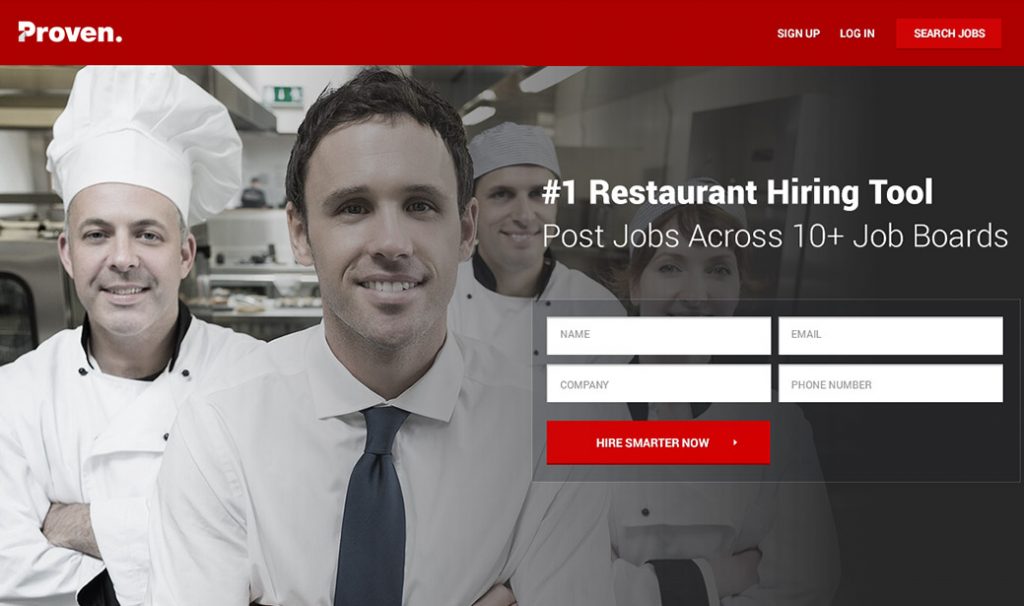
What makes it successful: Proven’s goal is to help businesses hire better and faster. This page targets restaurants with a simple design, strong CTA, and thoughtful use of color to draw the eye where it needs to go.
See more examples of successful landing pages and case study results here.
What is a landing page?
A landing page is a page on your website designed to get the user to take one specific action — whether that’s to provide their contact information, make a purchase, or something else meaningful.
Here’s how it works: People most often arrive on a landing page by clicking through an ad on a website, in search results, via social media, or in an email.
Landing pages are beneficial for businesses in all industries, including ecommerce, SaaS, and everything in between.
Website page vs. landing page
The main difference between a website page and a landing page is that the landing page is designed with a single goal in mind.
Website pages often have multiple goals and encourage users to explore, while landing pages focus on a single call-to-action (CTA).
Landing pages are generally designed with a more targeted audience in mind than the rest of your site. That means you won’t find them through the home page or navigational menu.
Types of landing pages
There are generally two types of landing pages: lead generation and click-through.
Lead generation landing pages are designed to get visitors’ contact information in exchange for a free resource. This can be a free ebook, webinar, whitepaper, private podcast, template, or any other kind of lead magnet.
Here’s a great example of a lead magnet landing page from CRM company HubSpot:
Notice that it has one goal: to get you to enter your personal contact information in exchange for a download of a business goal-setting template.
Click-through landing pages are designed to get visitors to click the CTA and be taken to a new page to follow through with the action.
The action might be to place an order, schedule a consultation, or do something more.
This click-through landing page from meal kit delivery subscription service Hello Fresh has a button with the CTA “Explore Plans.”
When you click the CTA button, you are then taken to a page where you can view pricing and sign up for a subscription.
Why are landing pages important?
Landing pages are important because they can help you get better results with your marketing and ad campaigns.
With a focus on one specific goal, a good landing page conversion rate can work to support your overall lead-generation efforts.
Here are just a few ways that landing pages can benefit your online marketing campaigns:
- Drive better results: Overall, landing pages help you get better results, since they’re focused on one primary goal and optimized for conversions.
- Simplify campaign measurement: It’s easy to measure and track the performance of your landing pages.
- Get audience insights: As you test your landing pages, you’ll get important insights into what messages and designs work best for your target audience.
The takeaway
Landing pages deserve a prominent place in your digital marketing plan.
They can be a significant value driver for your business, whether you leverage them as part of your pay-per-click (or paid search) campaigns, email marketing, or elsewhere.
You’re bound to see positive results when you create well-thought-out landing pages with the right mix of elements, a clear message, and an easy way to complete the desired action.
And if you need support creating high-performing landing pages for your marketing campaigns, we’re here to help. Reach out for a consultation.
This article has been updated and was originally published in December 2020.
