
 Improve Performance
 Fix Problems
 Learn
Learn Audit
Audit Case Studies
 Guides
 Blog
Blog Last Updated August 28, 2026


Display ads are visual advertisements that appear across the Google Display Network. While they are effective for retargeting high-intent prospects, they typically yield a lower CTR than other Google Ads. Learn from these examples to get more clicks from qualified leads.
Display advertising is an effective way to reach potential customers while they browse websites, watch YouTube videos, check their email, or use mobile apps.
With AI-powered optimizations for the best performance, responsive creative, and targeting, display ads are an impactful way to build brand awareness and re-engage shoppers.
In this guide, we’ll share real display ad examples and cover best practices for creating campaigns that capture users’ attention and drive conversions.
What is display advertising?
Display advertising is a form of pay-per-click (PPC) advertising that uses visual creative — like images, animations, and videos — to reach users across websites, mobile apps, YouTube, Gmail, and other online properties.
Advertisers can target audiences based on demographics, interests, online behavior, purchase intent, and remarketing lists.
Types of Google Display Ads
Display advertising is available across multiple ad platforms (including social media networks), however, Google Display Ads are the most commonly used.
Google offers several display ad formats, including:
- Responsive display ads (RDAs): Google automatically combines uploaded images, logos, headlines, descriptions, and videos into different ad variations to optimize performance.
- Banner ads: Traditional image-based ads that appear across websites and mobile apps. Banner ads are one of the most common display ad formats for building brand awareness and driving website traffic.
- Native display ads: Ad designs that match the appearance and style of the website or app where they’re displayed for a more seamless user experience.
- Rich media ads: Interactive ads that incorporate animations, clickable elements, expandable panels, or other rich media features to encourage engagement beyond a standard banner.
- Animated display ads: Ads that use movement, often through GIFs or short video snippets, to capture attention without requiring users to play a video.
- Video display ads: Short video ads that appear across websites, apps, and platforms like YouTube.
- Gmail ads: Ads that appear within users’ Gmail inboxes and expand into a larger, interactive message when clicked. They’re often used to promote products, offers, or lead-generation campaigns.
Key features of a great display ad
Great display ads typically feature:
- Logo: To establish brand identity and recognition
- Visual media: An attractive image or video of your product
- Value proposition: To compel users to click on your offering
- Call-to-action (CTA): A clear, standout button or text guiding the user’s next step
Balance these elements to highlight your value proposition and CTA.
Your goal is to stop the scroll, show your value, and get the reader to click using a CTA that’s hard to resist.
Display ads examples
Display ads notoriously receive a much lower click-through rate (CTR) compared to other ad formats.
But when done well, effective display ads can improve reach, boost brand awareness, and capture audiences that are ready to convert through eye-catching visuals.
Here are some of the best display ads that do just that.
1. MailChimp
MailChimp, a top email marketing platform, keeps things simple with its color scheme and logo. The ad tells readers that it’s more than just an email platform; it also offers CRM solutions.

Why it works: The value proposition is clear, and the CTA tells readers exactly what to do next — while using contrasting, bright colors that draw attention.
The simple logo, CTA button, and concise copy are given plenty of space to breathe for maximum readability and quick comprehension.
2. Ridge
Wallet and accessory manufacturer Ridge leverages a banner ad to showcase its most popular product — the slim, RFID-blocking wallet — in a side-by-side comparison to a traditional wallet.

Why it works: Ridge’s high-quality visuals show the product’s value proposition (a slim design) and the user’s pain point (bulky wallets), letting the images do the heavy lifting. The copy is concise and offers quick next steps with a clear CTA.
3. Chase Visa
Chase’s animated display ad cycles through images of its credit card, its core offer, and actor Ty Burrell to encourage viewers to apply for its United Explorer card.

Why it works: Chase uses specific numbers (earn up to 60,000 miles), smooth animation, crisp imagery, and supporting copy to get its message across quickly.
The “learn more” CTA button is clear and simple to avoid adding busyness to an already-active ad.
4. PayPal
PayPal uses this skyscraper ad to highlight a feature many users may not realize exists: the ability for merchants to accept Venmo payments through PayPal Checkout. The simple illustration reinforces the message without distracting from the offer.

Why it works: Rather than promoting the brand itself, the ad highlights a specific benefit that solves a common business need.
The minimalist design, recognizable PayPal branding, and single CTA keep the message focused, while the reference to Venmo adds instant familiarity and broadens the product’s appeal.
5. Samsung
Samsung promotes its Galaxy tablet by positioning it as a creative productivity tool rather than simply another device. The ad pairs a simple headline (“Create. Work. Anywhere.”) with a clean product image that showcases the tablet, keyboard, and stylus.
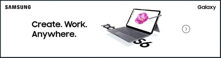
Why it works: Samsung focuses on the outcome rather than the product specifications. The concise headline immediately communicates the core benefit, while the uncluttered design and high-quality product imagery keep the viewer’s attention on the device. The minimal copy makes the ad easy to scan, and the creative reinforces how the product fits into its target audience’s lifestyle.
6. Pods
Nobody likes to move. And figuring out where to put your stuff in the midst of it all can be a hassle.
Pods recognizes this and paints itself as the obvious solution with this ad. It’s straightforward, relatable, and offers an answer to the problem.

Why it works: The headline immediately speaks to the customer’s need rather than the company’s features.
Clean visuals reinforce the service, while the bold CTA makes the next step obvious. By focusing on a relatable problem and a simple solution, the ad is easy to understand at a glance.
7. Shopify
Shopify is a powerhouse in the ecommerce space — and its static image display ad is a great example of simplicity and brand recognition. Its display ad offers one simple message and value proposition: “everything you need to sell online.”

Why it works: From the tagline and logo to the CTA and white space, this square display ad demonstrates how simplicity can be the most effective choice.
The color palette is immediately recognizable and consistent with its online presence, which can help increase brand awareness and recognition.
The offer of a free trial is a powerful draw, especially for those on the fence or unfamiliar with its expanded features. While the ad size is small, it packs everything it needs into the space.
8. Progressive
Insurance company Progressive advertises its average annual savings for drivers who switch to encourage users to get a quote.

Why it works: Progressive taps into the universal desire to save money with social proof (drivers who switch save $699 on average).
The call to action button pops against the orange background and feels like a low commitment (“get a quote”), which makes users more likely to click.
9. Disney Plus
Streaming platform Disney Plus leverages its brand portfolio power — stacking five distinct banners, each repping one of its owned studios and franchises, before landing on the Disney+ logo and a clear “Start Your Free Trial” CTA.

Why it works: In this ad, the visuals do all the persuading — signaling breadth and quality without a single word of description needed until the bottom of the ad.
The design keeps the CTA button simple and high-contrast (bright blue against a dark background), so even though the ad is visually dense up top, the action step at the bottom stays uncluttered and easy to find.
7 display ads best practices from the experts
Ready to use these examples as inspiration for your own campaigns? Integrate these best practices — with expert tips from HawkSEM SEM Manager Jackson Taylor — for the best chances of success.
1. Design for mobile
Cell phones aren’t going anywhere, so your ads need to be as mobile-friendly as possible to ensure they are successful. They should be easy to read, flow with the user experience, and be functional across all screen sizes.
2. Keep messaging simple
Write concise, compelling ad copy that speaks directly to your audience’s needs and desires. Your tagline should be memorable and SEO-friendly, incorporating keywords that align with your campaign goals to improve visibility.
“For images that use text, a large, legible font with a 6th grade vocabulary tends to perform the best,” says Taylor. “Short punchy headlines are usually always better than paragraphs of text on an image. User attention spans come at a premium already and dispaly ads make this even more noticeable. It is best to keep the reading on the shorter side.”
Ensure your CTA button is clearly visible, using action-oriented language that encourages users to take the next step.
3. Use high-quality visuals
“Quality beats quantity when it comes to image content for display ads,” says Taylor. “Professional photography outperforms hasty iPhone photos and AI-generated images almost 100% of the time, in my experience.”
4. Test multiple creatives
Use the power of A/B testing to fine-tune your ad campaigns. Compare different ad formats, designs, and messaging to identify which elements resonate most with your audience. Finding the best approach will lead to higher engagement and improved conversion rates.
5. Leverage remarketing
Tailor your ads to past site visitors to increase familiarity and trust, not to mention ROI. Take advantage of Google RLSA (Remarketing Lists for Search Ads) to tailor your campaigns to users who have previously interacted with your website, increasing the chances of re-engagement.
6. Optimize landing pages
Your landing page needs to mirror the design and messaging of your display ads. If someone clicks on an ad, they expect to see a similar experience on the next page. This includes font type, coloring, graphics, and overall messaging.
7. Monitor KPIs
Make it a habit to continuously monitor KPIs like impressions, CTR, and conversion rate to understand how your ads are performing. This gives you an inside view into how things are working and where you can make adjustments to drive the most impact.
Benefits of display advertising
Here’s why display advertising should have a place in your digital marketing strategy:
- Boosts brand awareness: Display advertising extends your brand’s reach by putting it in front of potential customers.
- Expands reach: The Google Display Network reaches over 90% of internet users worldwide. This network spreads your message and maximizes visibility across diverse audiences.
- Remarketing opportunities: Display ads make it easier to re-engage users already interested in your products or services.
- Measurable performance: Monitoring online advertising campaign performance shows if your efforts are worth it.
The takeaway
Building a successful display ad campaign is a journey, not a sprint. At HawkSEM, we know that while the basic rules of good display advertising apply to everyone, the real magic happens when those rules are tailored to your unique needs.
It’s all about attention to detail, being open to trying new things, and using a strategy shaped by top-notch experience to get real results. This is where teaming up with an experienced agency like ours makes a big difference.
Ready for better outcomes and a stronger return on your investment? Reach out to HawkSEM for a free chat.
This article has been updated and was originally published in September 2024